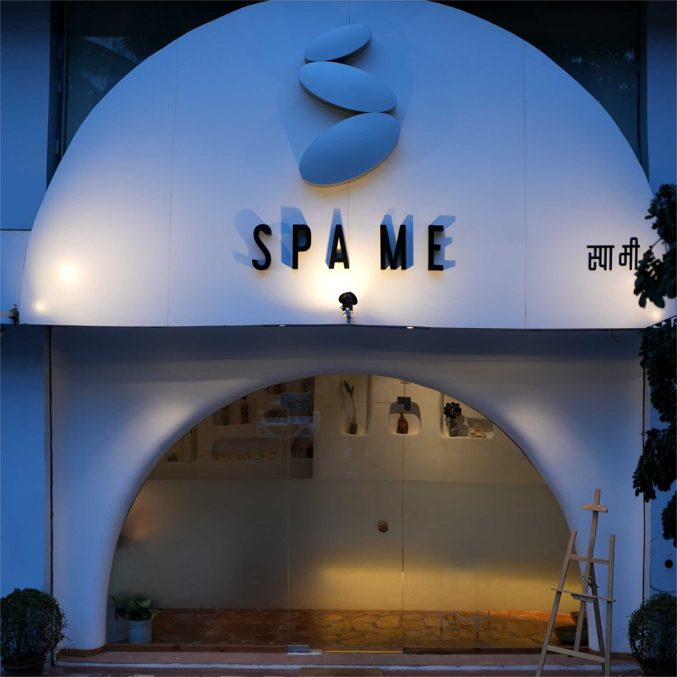
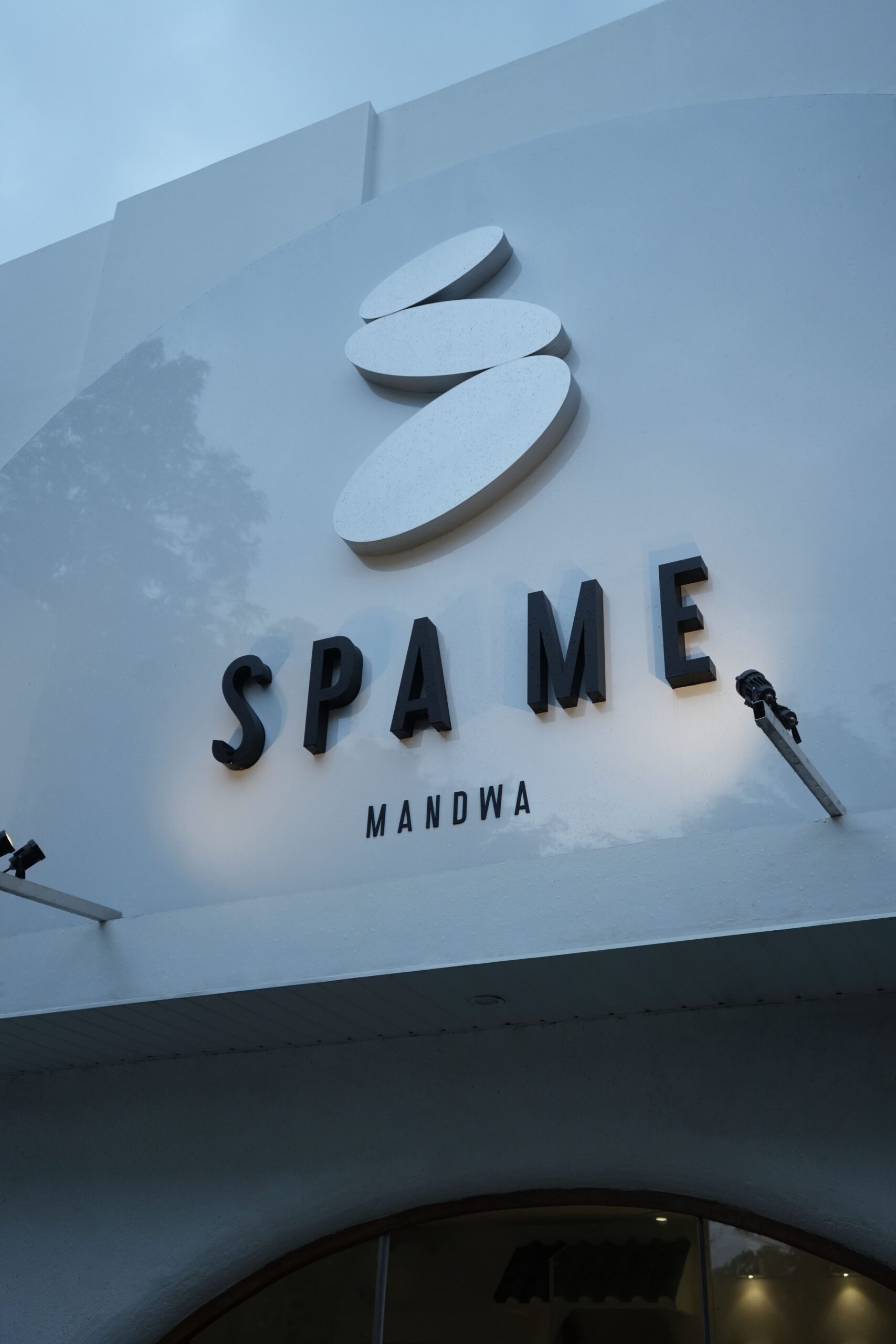
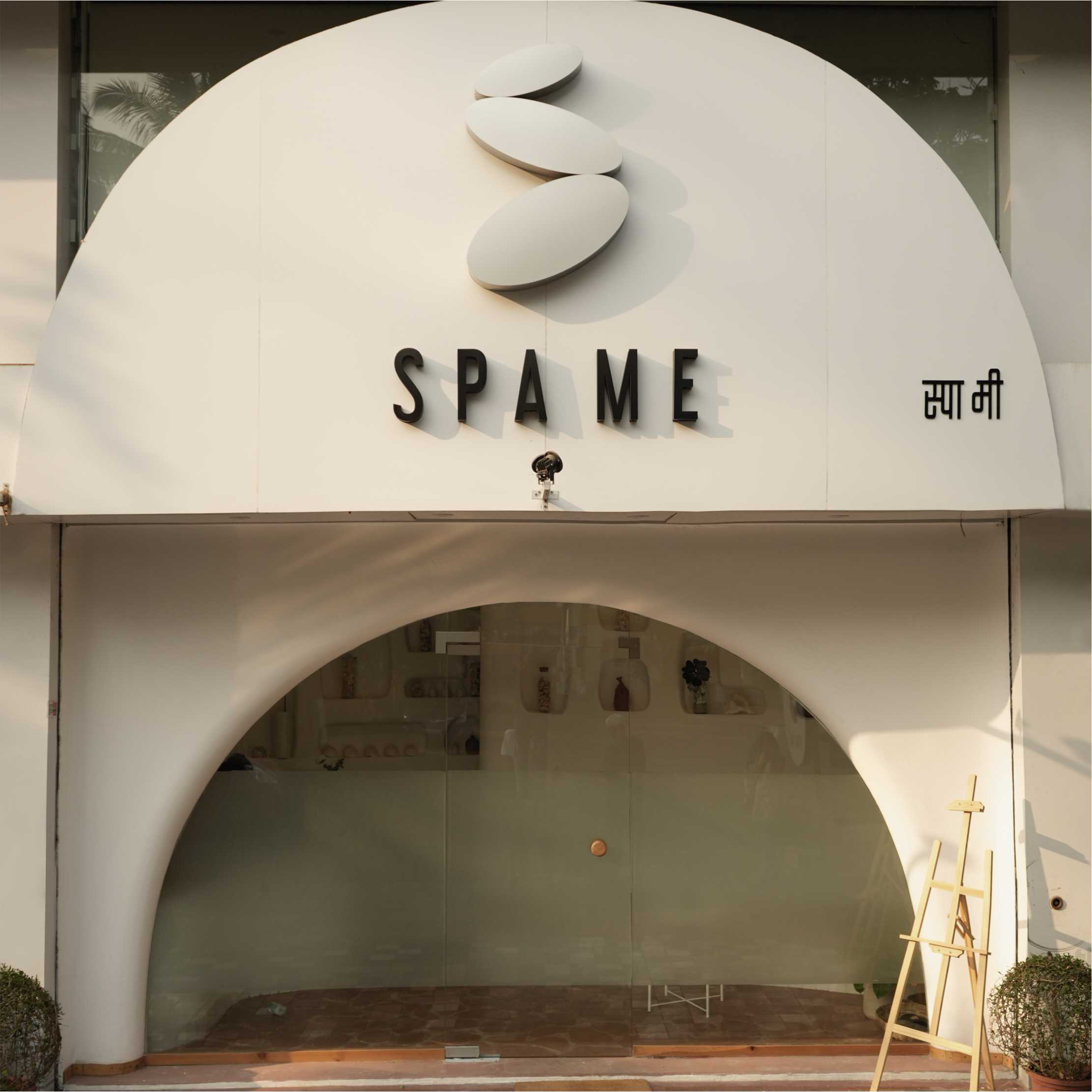
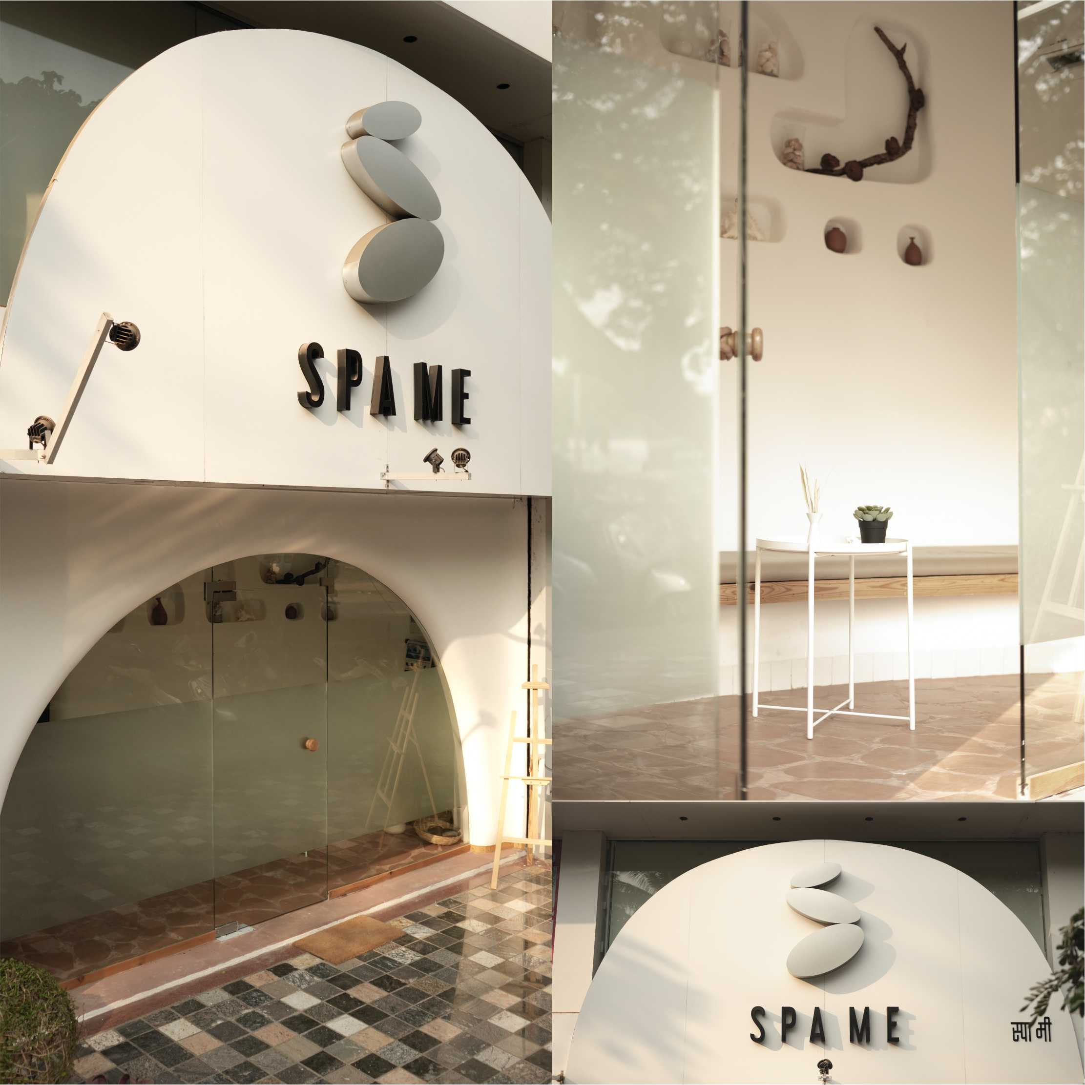
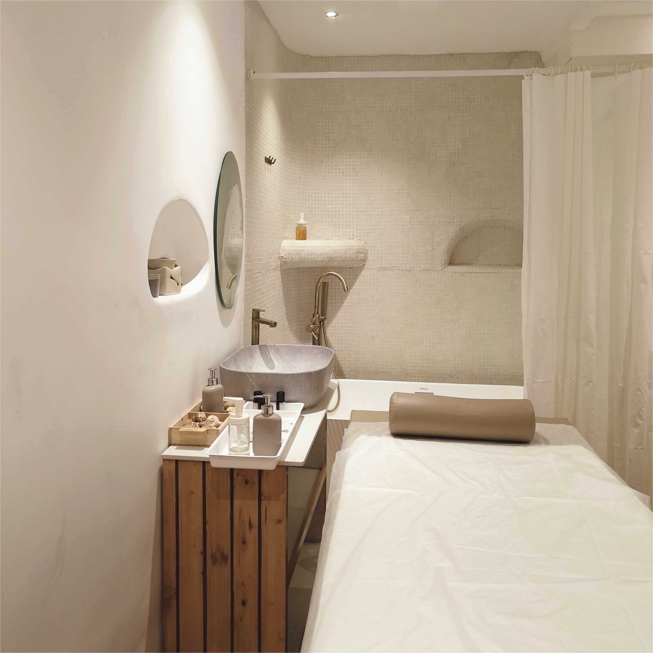
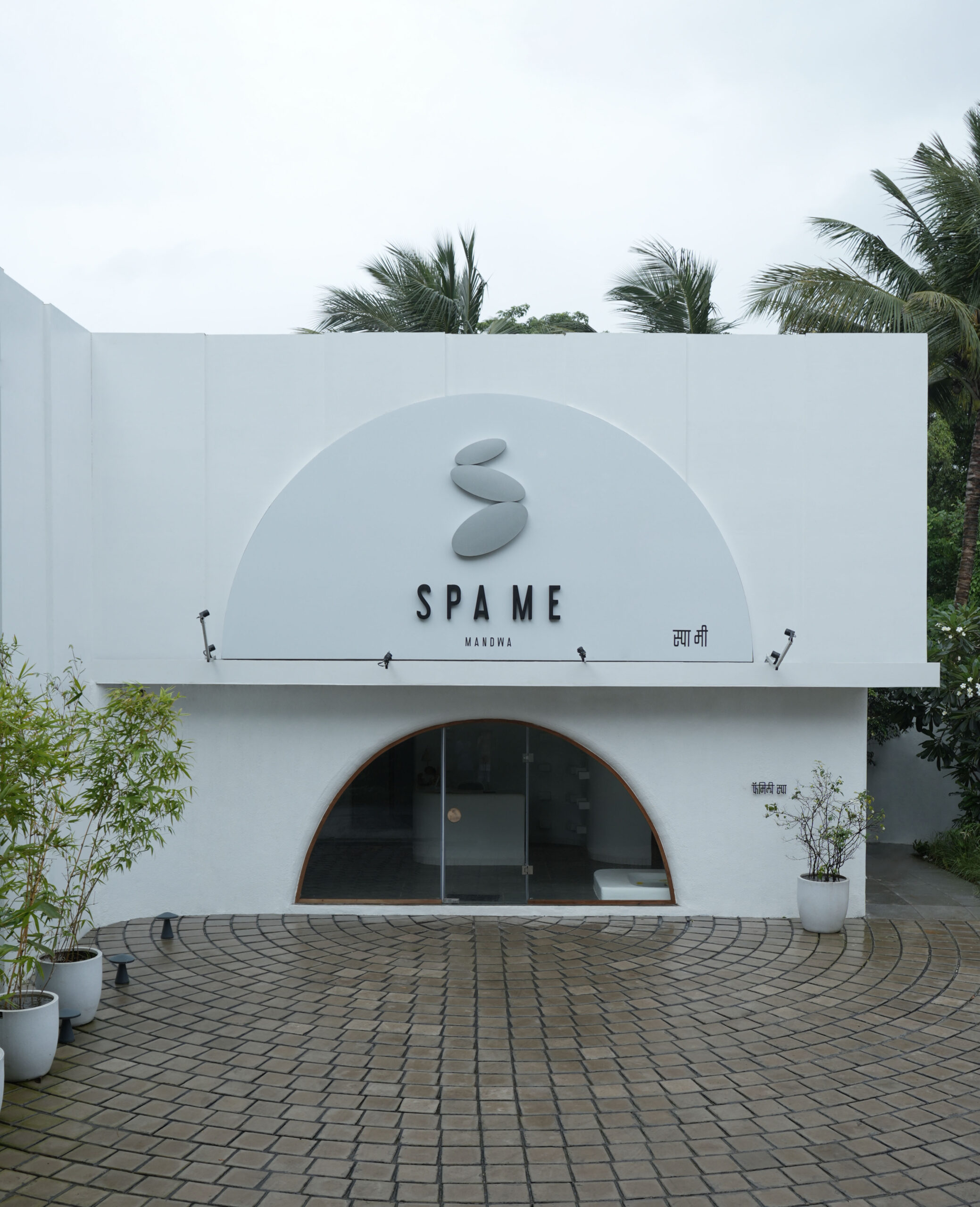
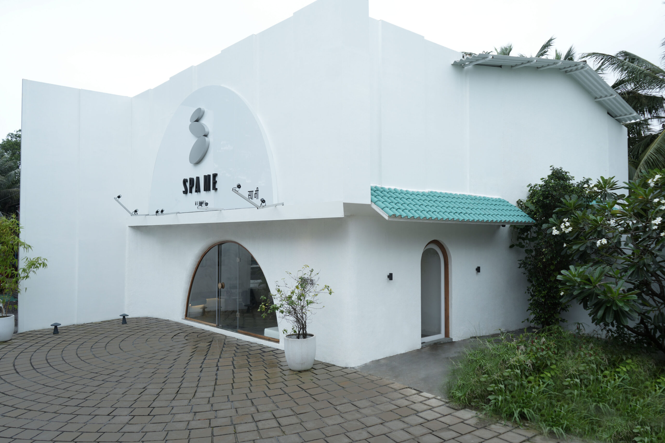
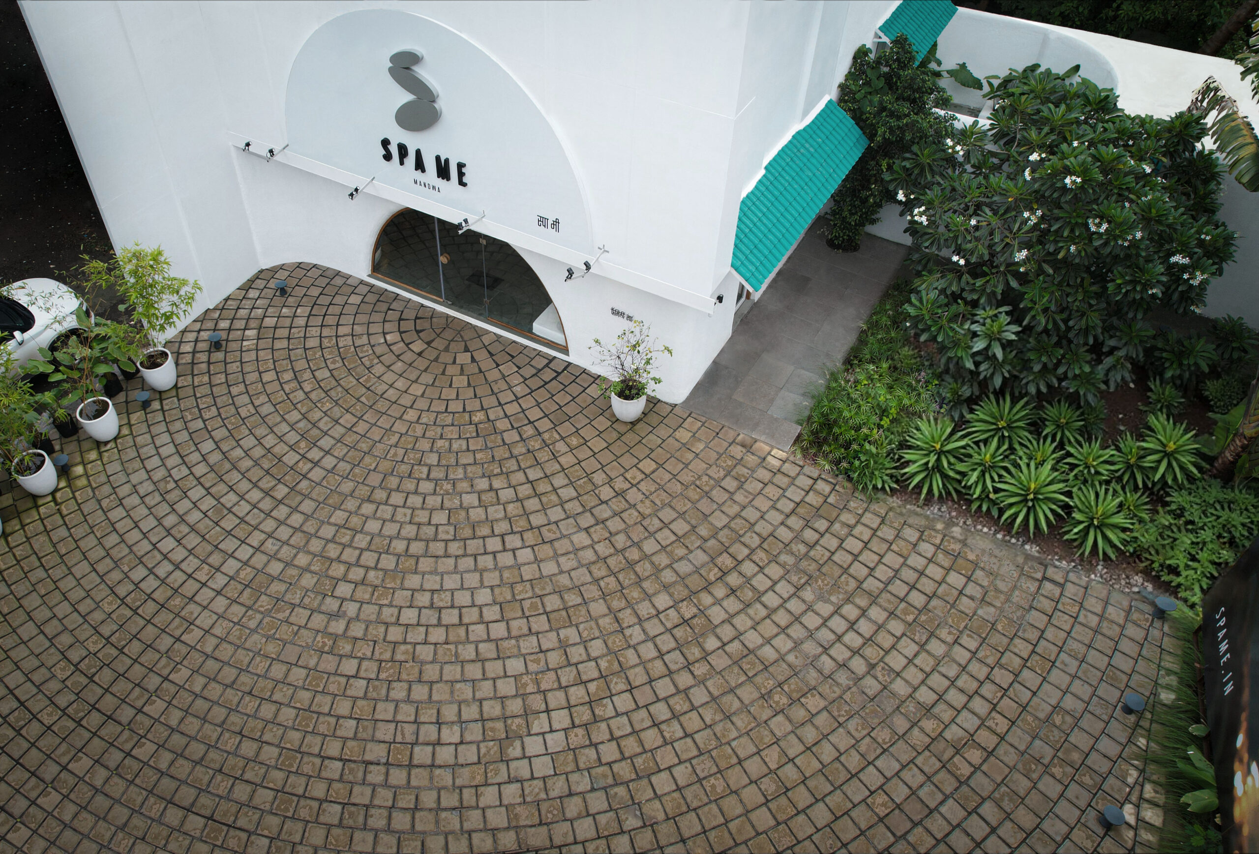
For a brand that heals body, mind, and spirit through professional massage, the logo needed to feel like balance itself. We aligned three smooth pebble stones, stacked in perfect harmony, to form the letter ‘S’. Each stone represents restoration – physical ease, mental calm, spiritual alignment. Simple, serene, and centered. Just like Spa Me.